From Feedback to Dialogue
Designing private follow-up conversations in Microsoft Viva Pulse
Overview
After managers reviewed survey results in Viva Pulse, many were left with vague understanding. We saw an opportunity to help them go beyond passive reading and start meaningful, confidential follow-ups with employees. I led the design of a lightweight conversation feature that enabled managers to clarify feedback privately, close the loop, and build trust without disrupting psychological safety.
impact
Empowered managers to follow up with confidence and employees to feel heard, driving a +9% lift in engagement.
role
Senior Product Designer
COLLABORATORS
1 Principal PM
1 Principal EM
8 SWE
1 UXR Consultant
1 Content Designer
Skills
Facilitating workshops
Product design
Stakeholder management
Interactive prototyping
User research + testing
timeline
Q2 2024
🚀 GA: Sept 2024
Problem
How might we help managers act on unidentified feedback?
In Viva Pulse, 70% of employees chose to leave feedback anonymously. Their responses were powerful, but it left managers without context or confidence to follow up. As a result, action stalled, engagement dropped, and the feedback loop broke.
💡
Managers wanted clarity.
Respondents needed safety.
opportunity
We needed to design a way for managers to safely clarify open-ended feedback, without making employees feel exposed. But first, we had to make those responses easier to find, interpret, and act on.

My role
I led end-to-end design, from reframing the problem to launching the solution. I collaborated closely with PM, engineering, and research to:
Redesign the survey results UI to reduce friction and surface clarity
Explore and test follow-up interaction models
Pivot the feature’s scope when privacy risks emerged
Adapt the experience for both desktop and mobile without adding new surfaces
process
🤔
Discovery
🎨
Iteration
🔎
Pivot
🧪
Validate
🚀
Launch
UI clean-up
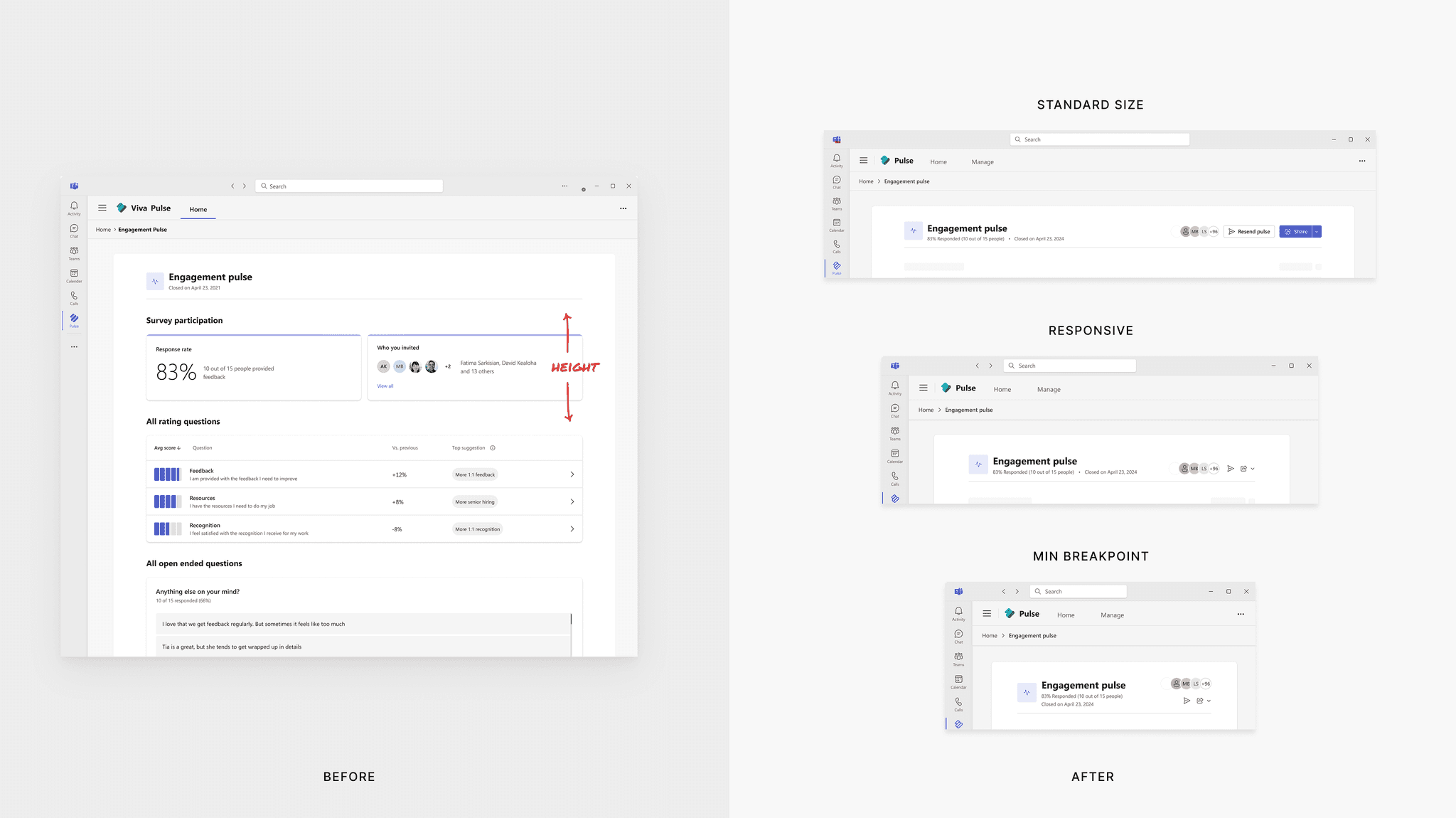
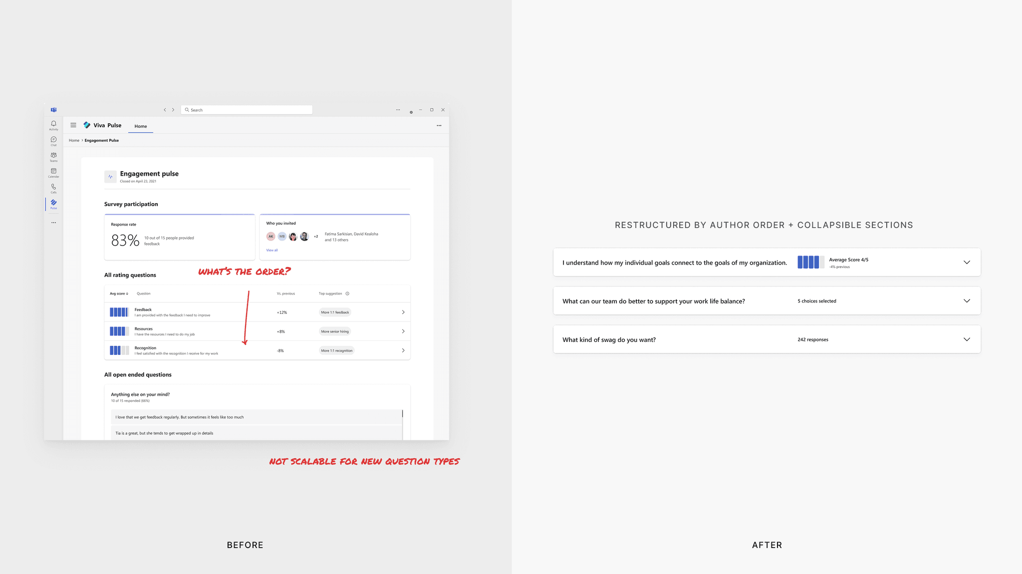
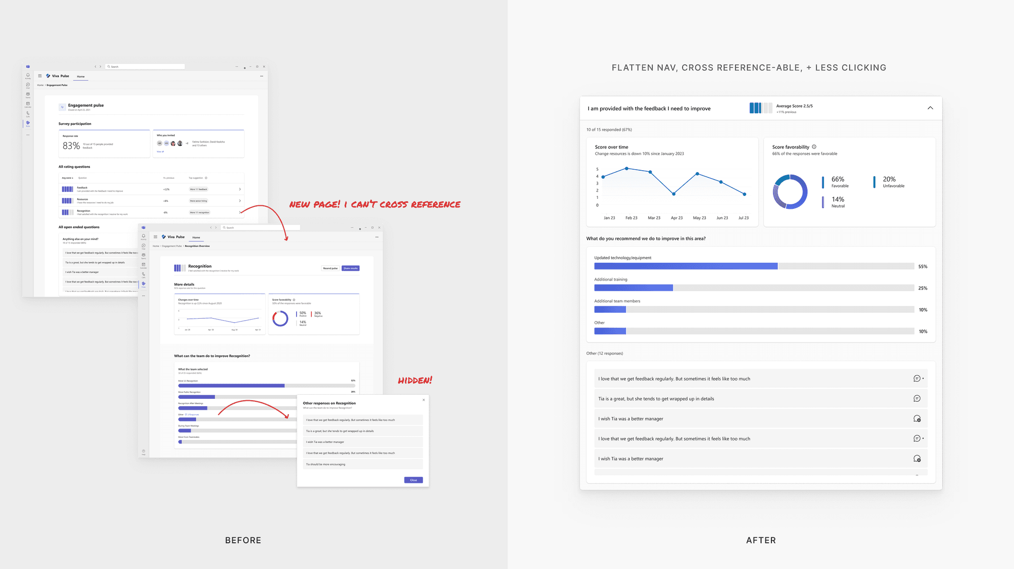
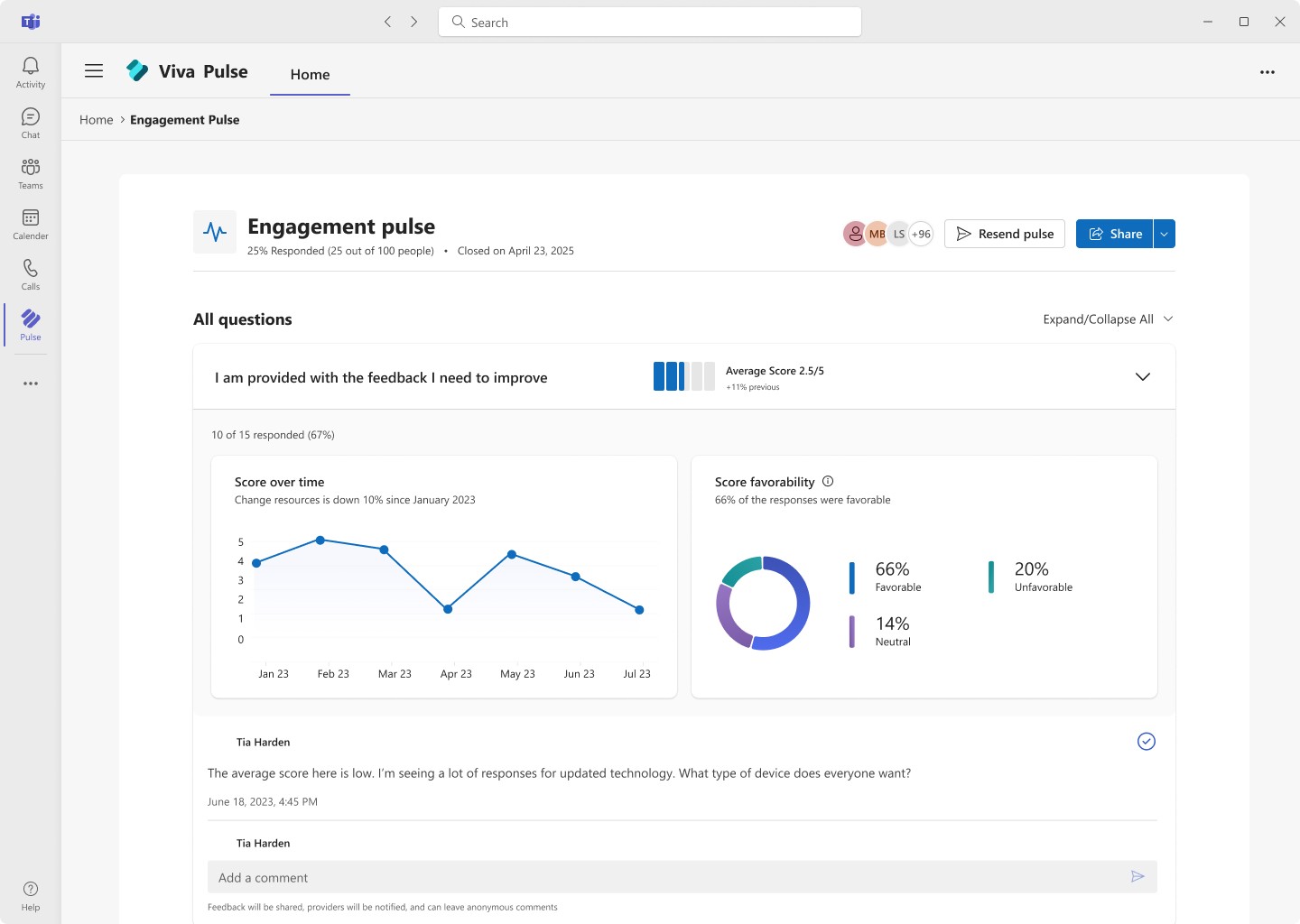
Laying the Groundwork:
Fixing Results Clarity First
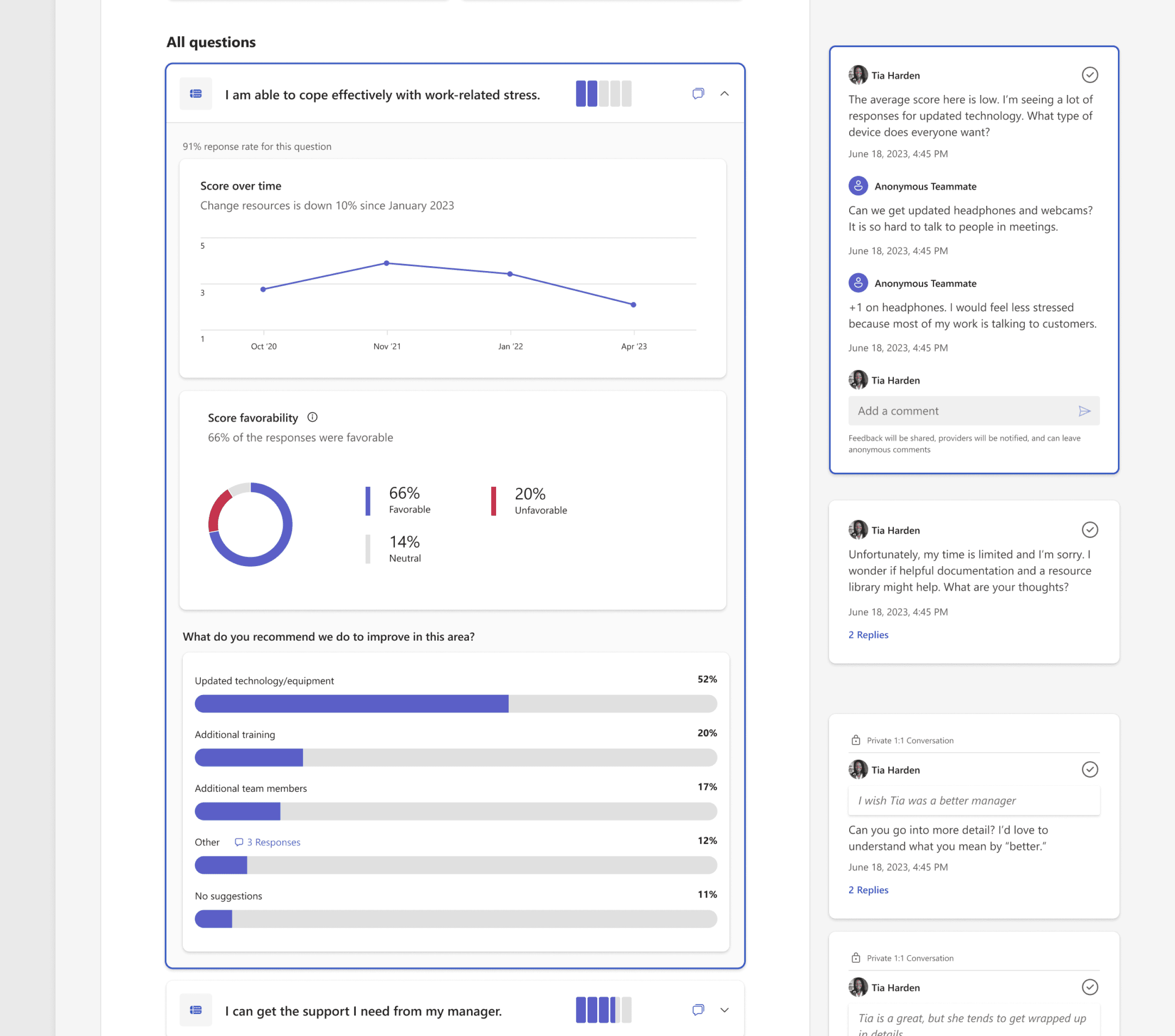
Before we could enable follow-up, we had to help managers see what mattered. The old results view was fragmented and click-heavy. Open-text responses were buried, hard to compare, and disconnected from the intent of the original survey.
I restructured the layout around two principles:
Make it discoverable
Help managers see the full picture without digging.
Make it collaborative
Feedback should spark dialogue, not just sit in a report.

Follow Viva + Fluent patterns
Keep it consistent with Microsoft design system.
key changes:
Reorganizing metadata to reduce clutter and improve scannability
Ordering questions by survey intent rather than format
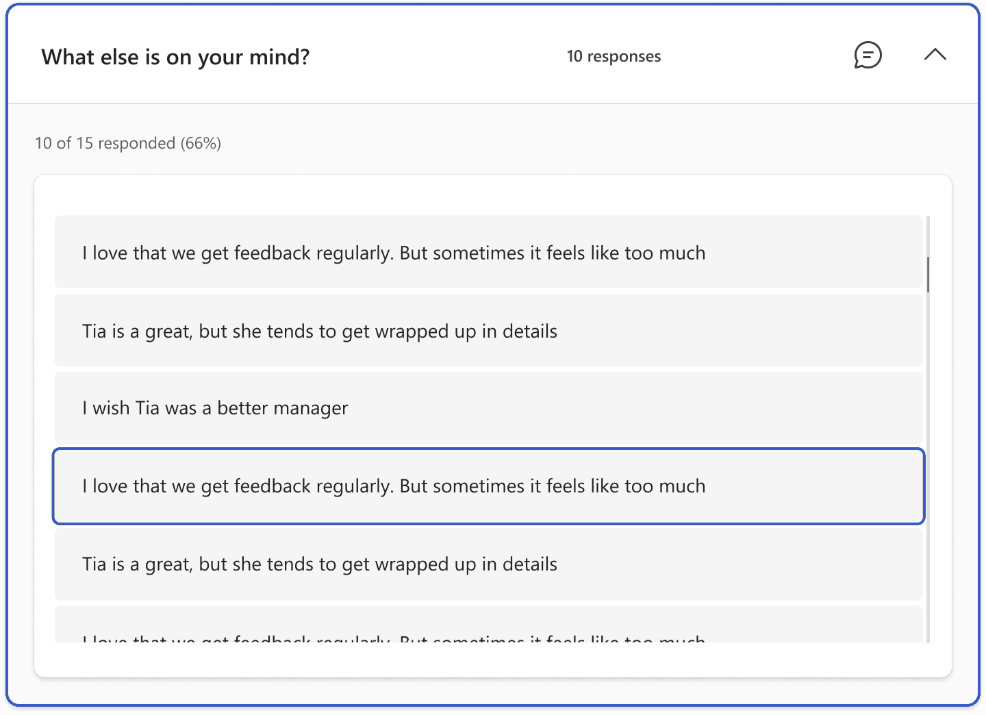
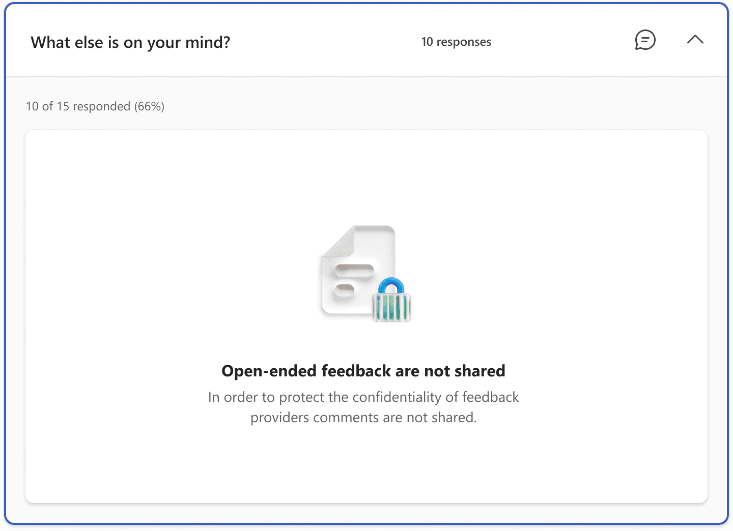
Making open-text responses prominent and all data expandable

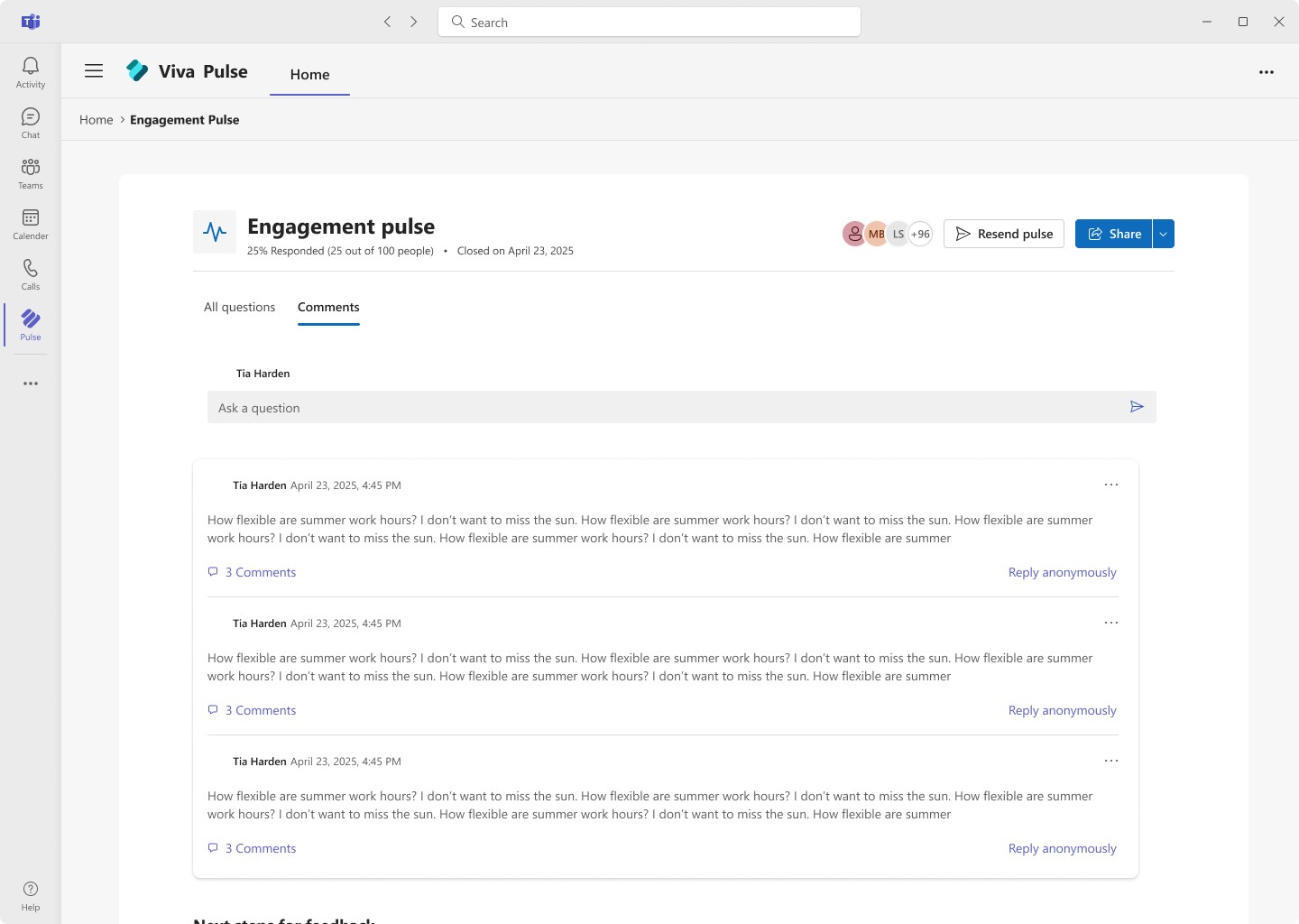
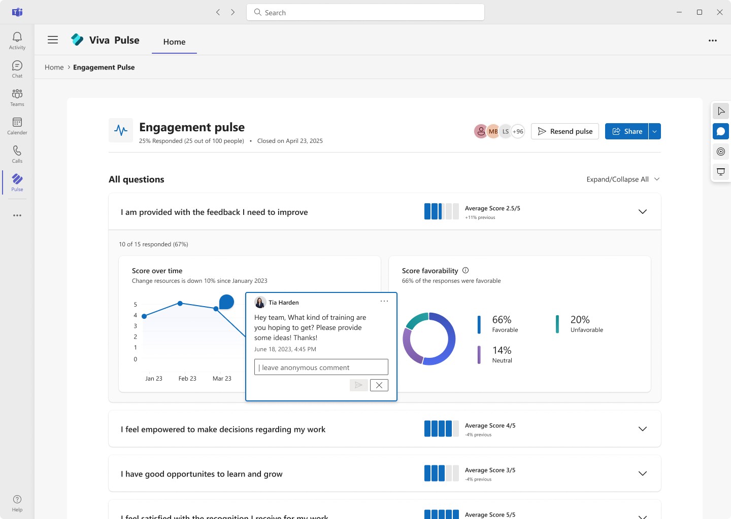
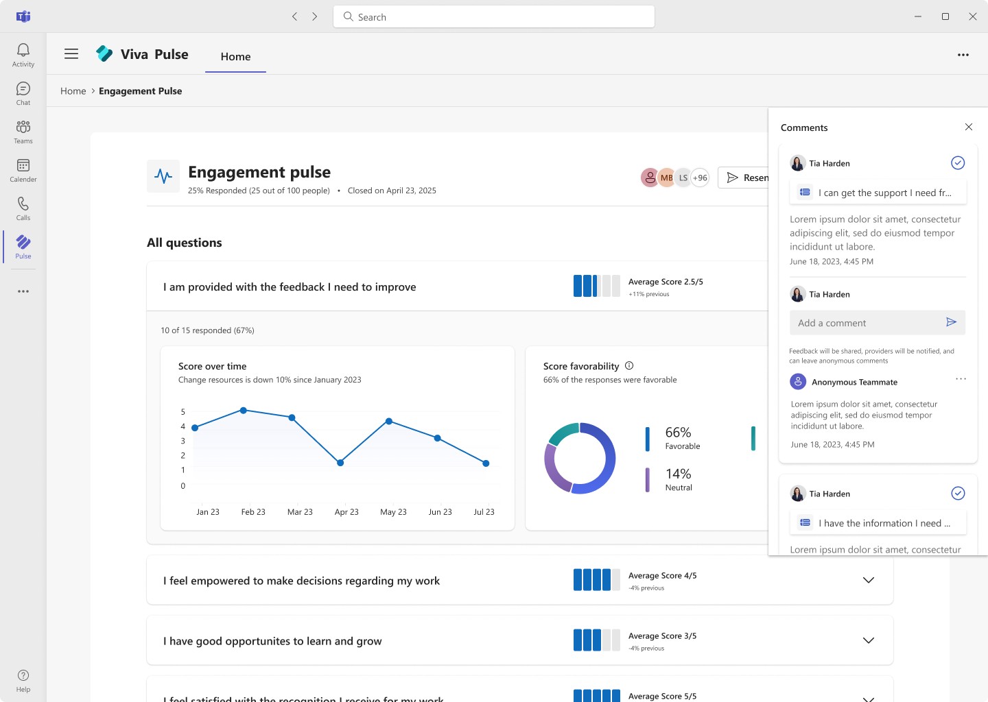
Streamline Conversation
Conversation design
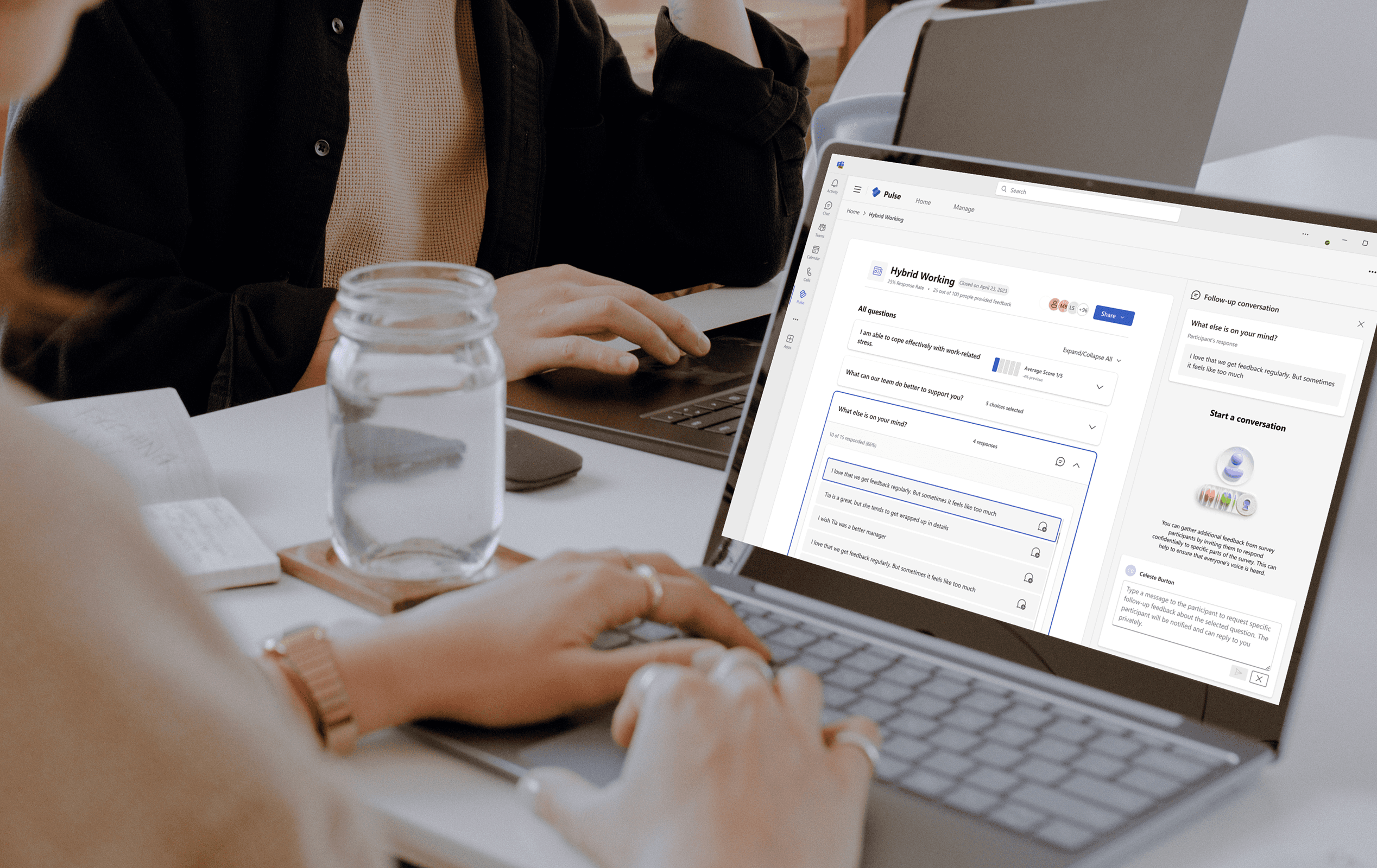
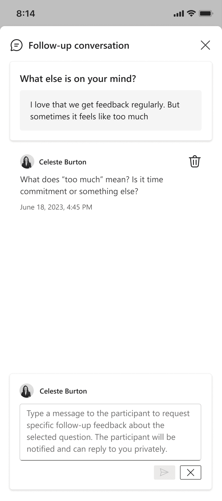
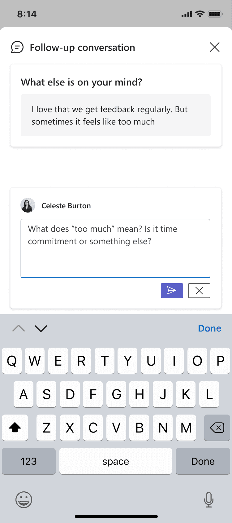
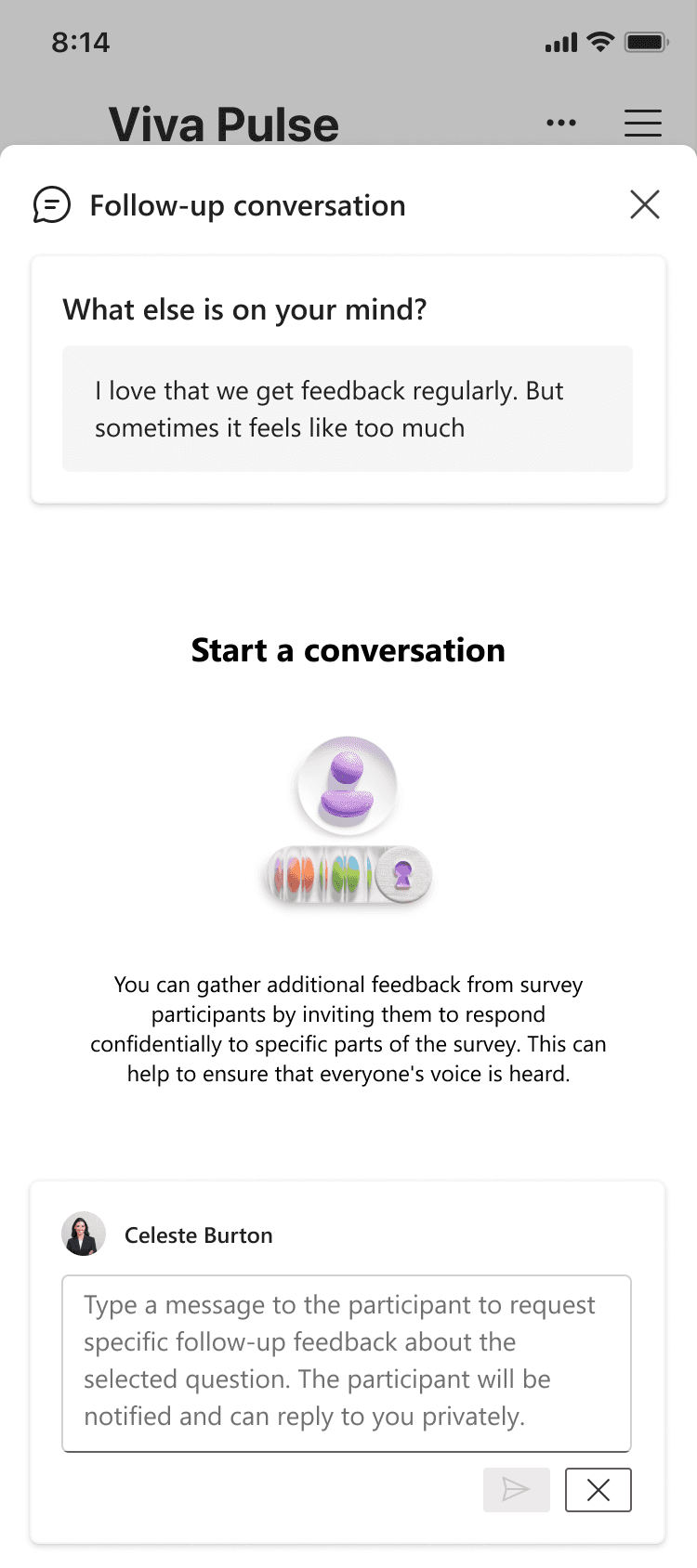
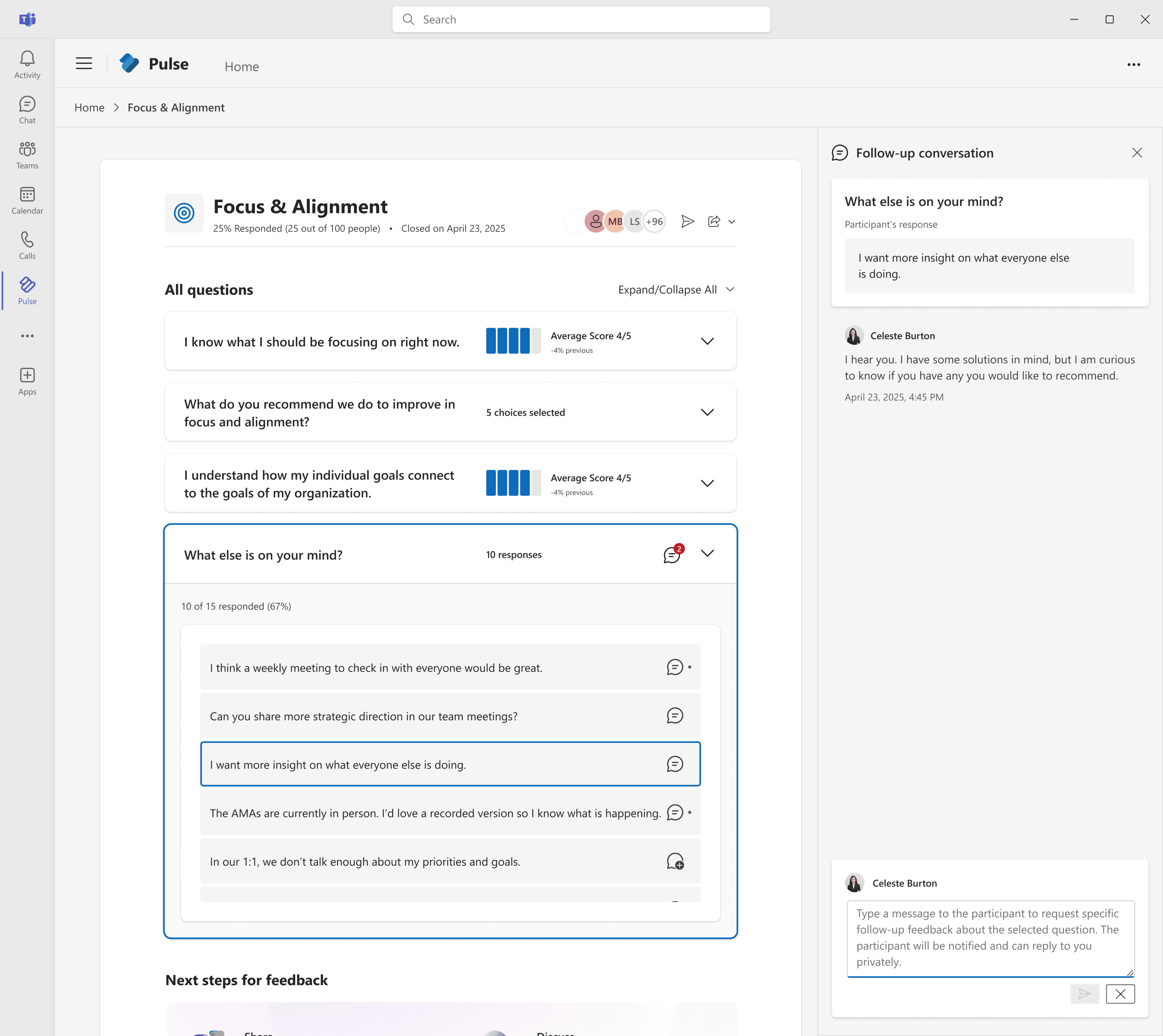
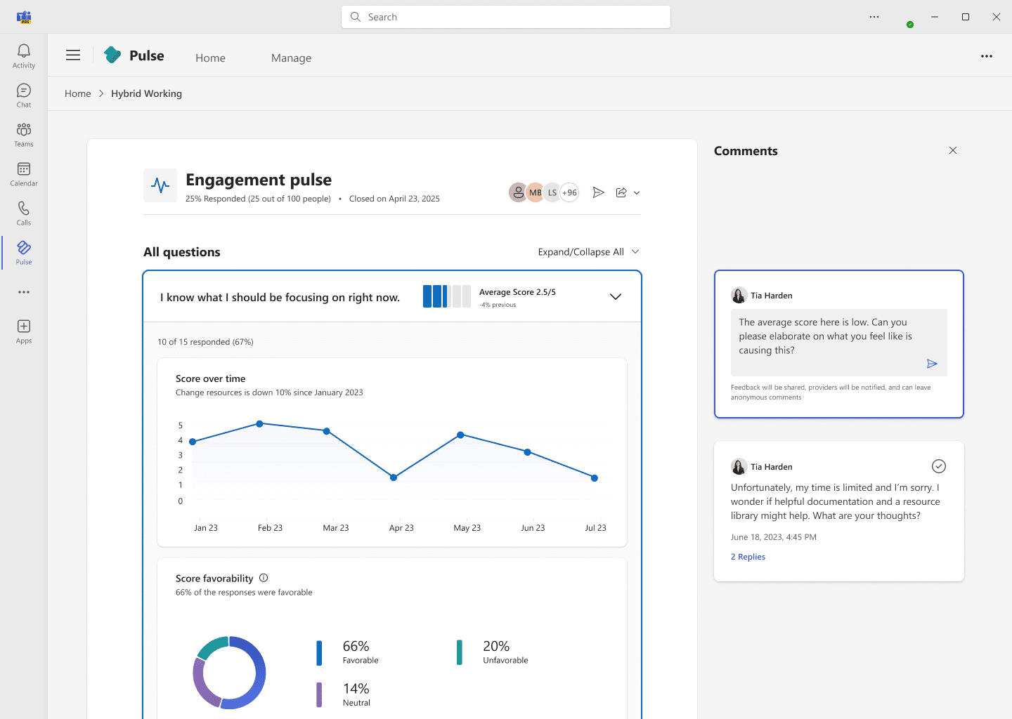
The Follow-up Experience
With clearer results in place, we designed a focused, 1:1 follow-up experience to help managers privately clarify specific open-ended feedback without compromising anonymity.
Managers can initiate a message tied to one comment
Employees receive an anonymous, secure notification
The conversation stays private and limited to one reply per side
💬 “It finally feels safe and doable.” - C0 Manager
key changes:
Grouping questions by survey intent rather than format
Making open-text responses prominent and collapsible
Reorganizing metadata to reduce clutter and improve scannability
author/manager Flow

direct/participant Flow
manager mobile design
Design process highlights
strategic reframe
Midway through development, privacy concerns emerged. What began as a multi-thread feature was at risk.
Challenges
Challenging content moderation
Risk of unintended audience
Could undermine trust
I partnered with legal and People Science, then proposed a pivot:
Shift from 1-to-many to 1-1, typing replies only to open-text to minimize visibility, maximize psychological safety
This lowered risk, preserved clarity, and positioned the tool as a trust-first solution.
before: Early concept
after privacy alignment
iteration and testing
I explored six layout directions including forum-style and modal flows. A side-by-side layout tested best: 85% of users preferred it in our early panel. One said: “This just feels natural. It lets me respond without second-guessing.” That gave us signal and confidence to move forward, reinforcing not just usability, but readiness to act.

All-in-one explorations
HAMBURGER ON PAGE

MODAL
SEPARATE TAB
Side-by-side exploration
side panel
open canvas
open panel
Outcome
metrics
50%
of initiated follow-ups turned into actual conversations
+9%
increase in share rates
455k+
total interactions
Lessons learned
Trust is not a feature. It’s an ecosystem decision. Follow-up conversation needs to signal safety, clarity, and intent. It also taught me that when risks surface, reframing scope is a strength. By narrowing the surface, we made the behavior more confident, natural, and effective.
💡Trust isn’t a UX layer. It’s something you have to design for at every level.
I’m proud of how we made it easier for people to speak up and feel heard. This is work that actually helps people connect, build trust, and take action.