📐 Setting the Foundation
Creating a unified design language and component library for Haystack’s growing platform
Overview
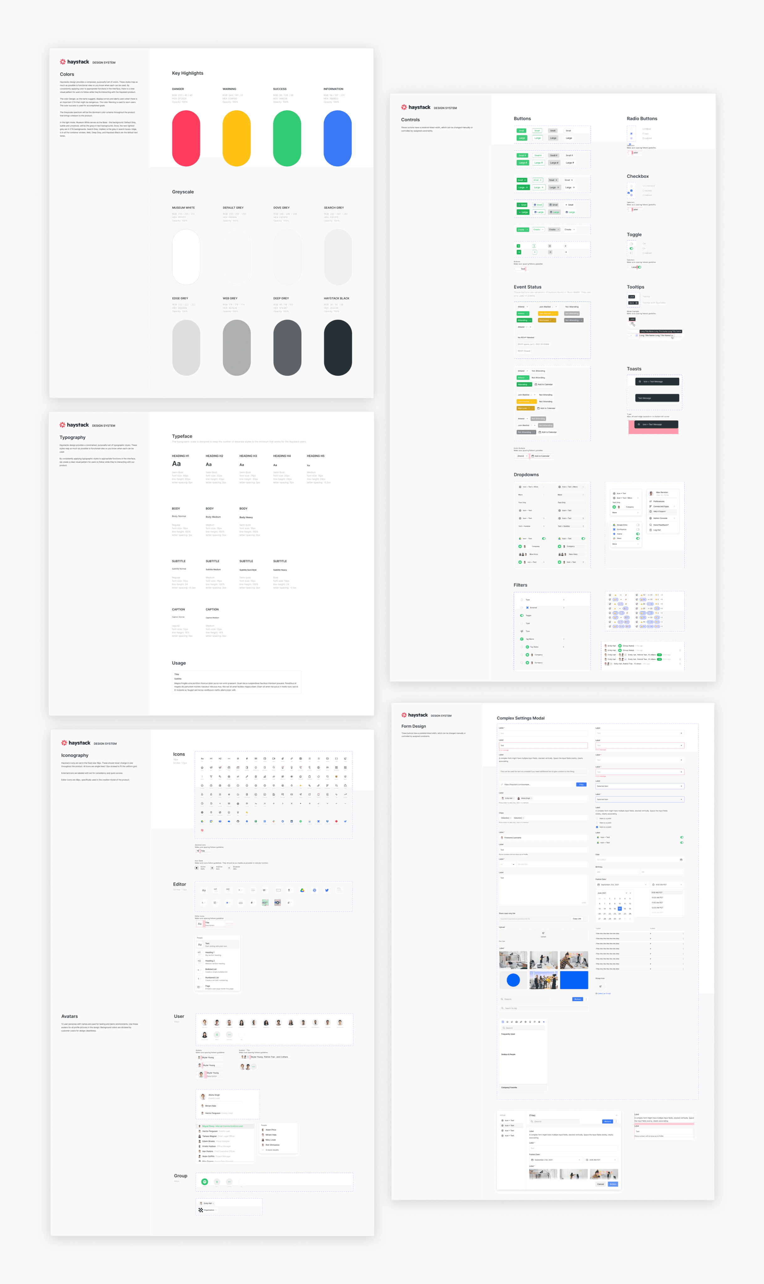
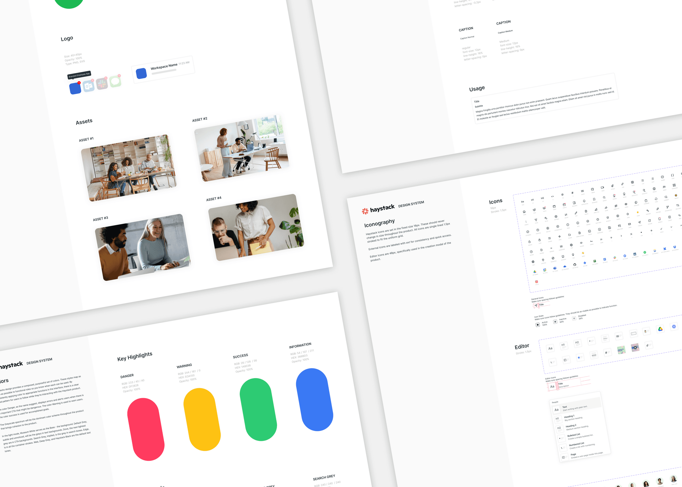
When I joined Haystack, the team was in stealth with just five employees. I led the creation of our first design system—defining the structure, language, and core components that enabled the product to scale. I began by setting design foundations and shipped the initial toolkit in May 2021. As the product evolved, I continued to expand and refine the system to support new features and visual consistency.
role
Product Designer
timeline
Apr 2021 - Jul 2023
Challenge
The growing design debt was slowing down velocity and creating inconsistency across the product. There were no shared standards.
Key gaps I identified:
1. Inconsistent Design Language
Lack of shared visual and interaction standards like spacing, typography, and tone, led to a fragmented user experience across the product.
2. Fragmented Component Ecosystem
Components varied widely across projects, resulting in duplicated effort and an unpredictable experience for both designers and engineers.
3. Inefficient Creation Workflows
Without reusable foundations or guidance, building net-new components was time-consuming and slowed overall velocity.
What I heard
Feedback from teammates revealed misalignment and repeated confusion:
"Which style do we use here?"
"I noticed this component is different throughout our app."
“What are the customer-facing colors?"
This lack of clarity showed the need for shared foundations and decision-making frameworks.
Thought starter
To set a direction, I defined three design principles that could flex with product and brand needs:
Modern & Elegant
A space for content and culture to shine beyond boundaries. Inherently efficient, resourceful, invisible
Balance
Using juxtaposition for curated content and celebrated connections. Embrace constraints within a frame while empowering culture
Scalable
Centralized in one location. Adaptable and accommodating globally in product, people, and places
Likes and dislikes
To guide visual direction, I gathered team feedback and clarified what to lean into—and what to avoid:
Likes
Playful but clean UI
Purposeful, systematized design
Personality through lightness and ease
Dislikes
Heavy skeuomorphism
Overly saturated color schemes
Generic "startup-y" visual tropes
Design system
The system included color, type, iconography, and interaction specs, designed to be flexible yet opinionated. It improved design/development velocity, ensured cohesion across teams, and made it easier to onboard new contributors.